Kiss.com Review

 Visit site


Rating: 2
May 16 2013

About
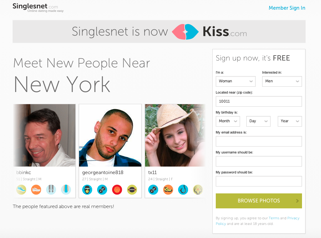
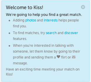
Kiss.com is the reincarnation of SinglesNet.com with a whole new look and feel. The site is a bit different then most with a couple of unique features. When setting up your free account you only need to fill out the basics (Email, Zip code, Username and Password). The only other screen you will encounter during the set-up is a page that asks you to click on little icons that represent the “Interests” in your life. You can either acknowledge that you “Like” or “Love” these different interests, but you can only like up to 5 so these need to be carefully chosen as they will represent most of your displayed personality on the site. After that your account is set-up and they bring your right to the home page. On the homepage there will already e a list of “Quick Matches” even if you didn’t fill out anything other than your interest during the a set-up process. So they seem to be very focused on your selected interests to match you up. The only downside I see to this is that there is only a limited number of interest you can select, so you’re a bit restricted in how much of yourself you can display on the site while only having a few options to choose from. The site does have a nice brief little tutorial of what you can do with the site and how to do it, but the fact that it is so brief is an indicator that at the end of the day the site really doesn’t have all that much to offer.
Features
- The profile pages tell you exactly when the last time the member was “Last Online” telling you if they were on in the last 24 hours or if its been longer than a week.
- The site allows you to “Discover” members profile pages by displaying at random a brief version of their profile and asking if you want to “Save and Let Them Know” or “Skip”
- You can send a member a regular message or you can flirt by selecting a pre-written message from a list of options such as “How are you?” “I think were a good match” “I like your photo” or “Send me a message!” The last one seems a bit in your face since your best option would probably be to send the user a message yourself.
- See the interests a user has liked on their profile page. The ones that match up with yours are displayed in color while the icons that differ from yours only show in black and white.
- “About Me” section of the profiles pages is the only portion you can fill out in your own words and is probably the best way to gain a sense of a members personality.
- The “Search” feature has very few search terms only allowing you to select the sex you’re looking for, their age range and proximity and you can organize the search results by “Who are online”, “Who are nearest” and “Who’s the best match”.
- “Activity Stream” shows you when a user has selected a new “Interest” or if they added or updated there “About” information on their profile page. It tells you that you can only view this information about a user if you have filled out the same information on your profile page, unless you just manually select to view the user’s profile then all the information is there.
Pricing

The site does provide a 30 day guarantee which allows you to request for your money back if your unsatisfied with in the first 30 days after signing up, no questions asked. Hopefully this isn’t an empty promise as I have run into those in the past with other online dating sites and been left waiting endlessly for my supposed refund.
Drawbacks and Caveats
I don’t know if I’m the only one thinking this but lately there seems to be an increasing number of new online dating sites that have an updated and slick-looking design with a great layout, but the site really has nothing unique or different to offer and just ends up being another run of the mill, mediocre and ultimately disappointing dating site. Kiss.com is a refreshing when your first signing up with the selection of your interests with cool little icons, but once this process is over you quickly realize that this is the only interesting quality about the site and that the rest of the features are really nothing special and are mostly the same as any other dating site offers. The site will even provide you a list of matches based solely on your selection of these icons to represent your personality although they really only give you so many options. Under hobbies they didn’t have anything for writing, which for me is a big one! The profile pages are overly basic. The only things you need to do are pick your interests with the icons and fill out the about me section, besides that there’s no other useful information for other members to use in order to gain some more knowledge about you.
Conclusion
While the initial impression of the site is promising since the process of selecting your interests in fun and refreshing. But after exploring the site and actually putting it to use you will quickly realize that Kiss.com is certainly nothing special in the world of online dating. It’s another entry in what seems to be an insurgence of dating sites that are at first flashy and new, but then quickly reveals its self as a mediocre middle of the road site that gets boring really fast. While the price is certainly impressive, there are plenty of other sites that offer a ton of features that Kiss.com doesn’t and will give you a lot more bang for your buck. Do yourself a favor and don’t waste your time with Kiss.com and opt for a dating site that has a ton more features and guarantees results like SocialSex.com or SexSearch.com
BACK TO DATING SITE REVIEWS INTERNET DATING AWARDS HOME DATING TIPS BLOG


